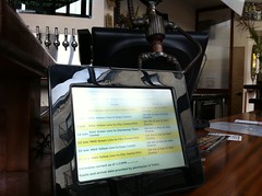
The original Transit Board UI |
The Transit Board™ display application has been the primary display mode for our Transit Appliance project, featuring a paging display ordered by the timing of vehicle arrival.
It has served us well, but it’s not perfect. The display was somewhat busy and – especially when trying to display many lines and stops – the text could be small. Multiple arrivals for a given route also chew up a lot of screen real estate.
So I’ve been watching what’s going on in other cities – and since great artists steal – I was inspired by this display in DC (which also incorporates bike share – something for our future!).
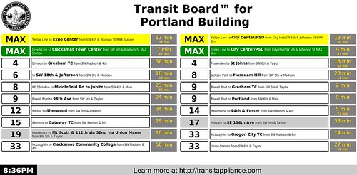
Here’s our version, now dubbed “Transit Board™ By Line”:
|
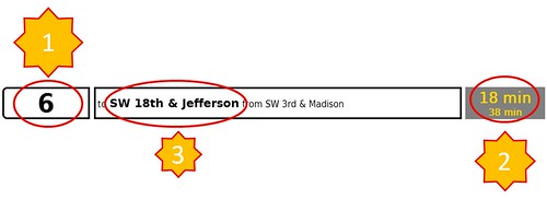
The design deliberately gives prioritized weight to critical information. First priority is the line designator (also color coded for MAX lines) followed by the time of the next arrival and then the destination/terminus. Other information like boarding point, route name and second arrival is given less emphasis.
Bonus points for anyone who can tell me what the color coding for the bus lines means.
|
The arrivals are ordered by line (starting with rail lines – sue me) and then direction – so often (but not always) inbound and outbound trips will be paired (split destination routes can also muck with this).
This is just about ready for prime time – we’ve been testing it at the Portland Building and at the 1201 Lloyd lobby. It’s now in the configuration tool and we’ll be converting units over gradually. And of course we’ll keep looking for opportunities for improvement.
Suggestions?
9 responses to “Transit Board(tm): New and Improved”
Bonus points for anyone who can tell me what the color coding for the bus lines means.
I think green ones are Metro and blue ones are ART (Arlington) ones.
Actually, blue ones are Metrobus and green ones are ART. Note the logo behind the green ones.
Tried using the documentation information, the board produced there is the old version.
Nonetheless, it looks like the “Frequent Service” bus routes are white with black borders, with the others in grey.
My only question on the colors is if the yellow-on-grey arrival times look better on actual equipment than they do on my screen.
Props to Jason Barbour, the white background bus lines are indeed the frequent service lines.
I find the gold-on-gray arrival times very readable, but would be interested in feedback from others looking at real screens (1201 Lloyd, Portland Building for now).
I’m working on a mockup with some ideas to show you. What resolution and physical size is the appliance’s screen?
The Chumby screens are 800×600. The resolution of the flat screens is a function of both the screen and the particular graphics chip in the Atom machine uses. It can range up to 1920×1080, but the most common resolution is 1366×768.
Is it still updating such that everything disappears and then a new table rolls back down? It would be better to have the rows just have their times updated in-place and roll them up or down individually, if there are new ones or the order changes, so it’s not so disorienting. I’m going off an older live demonstration I saw in my own browser, not sure if that’s the way they still work. If you have your eye on one of the rows and then it updates that animation is worse than none at all, you need to find it all over again.
How does the design communicate the logical difference between the left and right columns?
The legibility could be improved. Have you tried light-on-black schemes on any of the devices? I suspect you may get better contrast and readability but that will vary by panel technology, typefaces, and ambient light so who knows. That grey behind the gold there is exactly 50% between black and white, it’s probably going to be hard to make just about any color work on it. I’d go lighter or darker.
I’m using the scaled-down link to the full photo of the board on the blog here as a proxy for what this will look like when it’s a smaller portion of your visual field. It seems to me it could use some reorganizing but even without, I think I’d at least try getting rid of those black borders, bump up the font sizes, and let the minutes-left have the full height of the cell. There’s a surplus of horizontal space so show the next arrival after that by having it to the right instead of underneath.
I think those #1, #2, #3 priorities are a little off. Before you can check how many minutes away the bus is, you need to find it on the board. It will be tricky to learn which line 6 is yours without knowing where it is headed, so I’d consider the portion you are bolding but in priority #3 right now as pretty much equal in priority to the line number.
Heck, some people don’t know which bus lines go where, so that may be the first thing they’re going to look for. Right now crammed together is both the destination and the stop location but they’re logically apples and oranges. I’m eager to see what David comes up with.
It no longer “rolls up” the screen before updating to the next set of arrivals, it’s more dynamic.
Here’s a test url where you can see it in action in your browser.
Thanks for the link. Lot better than what I was looking at. From a little bit of research, am I correct in assuming the Chumby devices are rendering with WebKit and so is/could Debian? Happen to know the oldest WebKit version deployed and must be supported?