Things got busy, so it took me until this weekend to download demographic data to go with our Transit Scores for census tracts. Before we go any further, I want to make some caveats VERY clear:
- The demographics are ten years old (2000 census)
- The scale is coarse, we probably ultimately want block group level data
- The large areas outside the service district probably skew the results (another problem that block groups will help with
- I don’t at the moment have any way to put margins of error on the correlations
With that out of the way, let’s start with the data. Using the very helpful American FactFinder tool. I selected all the census tracts in Clackamas, Multnomah and Washington counties, then grabbed one data set for geographic data (land area) and population (including race) and another for median income:
I then matched these to our transit scores by census tract and removed the tracts that were completely outside the service district (and therefore had no scores).
I then did some VERY simple analysis using Excel, specifically the CORREL function and some scatter charts. But I did establish some simple correlation coefficients:
- Transit Score/Density: 0.67 (1.00 would be perfect correlation)
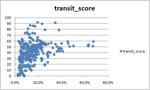
- Transit Score/Percent non-white: 0.40
- Transit Score/Median 1999 Household Income: -0.52
The magnitude of the coefficients represents how well correlated (and correlation DOES NOT imply causation) the two quantities are. The sign indicates whether they are correlated in the same same direction. So the negative coefficient for income indicates that as median income goes up, Transit Score goes down.
The spreadsheet is here, I welcome anyone with more statistics than I have to improve on the analysis or interpretation!
Here are the corresponding scatter charts:
So what does this mean? At this coarse level, this would seem to confirm the reaction of one TriMet planner when briefed about our intended efforts here. I’ll paraphrase: “Lower income people use transit more often, and we plan service to meet ridership demand.”, essentially expecting that we would see a negative correlation between income and service quality.
Obviously it’s also no surprise that density is the mostly strongly correlated factor.
But keep in mind the limitations of our approach here: these numbers don’t tell you if buses are passing by riders because they are full, they don’t tell you whether there’s a shelter at a stop, they don’t tell you if there are sidewalks to get to the stop… You get the idea.
And they don’t yet tell you if recent service changes have made the correlations weaker or stronger (which I think might ultimately be the greatest utility for this analysis). For that we’re going to have to wait until we accumulate some history.
Thoughts about where we go next coming up in a few days (I’m going to be busy at RailVolution this week!).


