|
We’ve discussed before that making the fare system for Streetcar easy to use is a challenge. Our fareboxes are somewhat unreliable and are difficult to use. We hope to acquire much better fareboxes when we make the leap across the river.
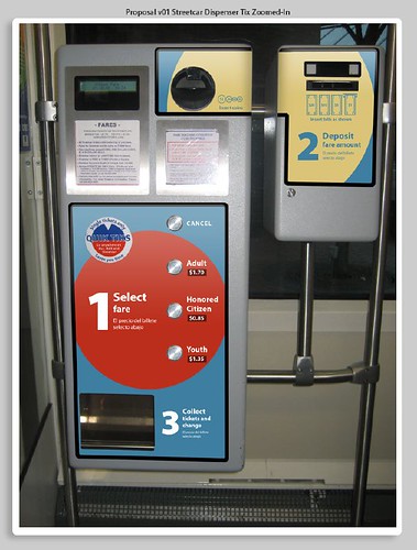
However, until then, we’d at least like to make them easier to understand. Local designer Sean Moran (artoflbliss.com) has worked up new graphics that we think might go a long way to help. The design is both intended to reference some TriMet fare machine idiom while retaining a separate identity for Streetcar.
He presented this idea of an enthusiastic Streetcar Citizens Advisory Committee earlier this month. Now we’d like your feedback!
23 responses to “Easier Streetcar Tickets”
The eye looks for “2” but it’s in a different place –and color– then “1” and “3”. It should build off the “1” and be in the same style/color…at least to MY eye.
I agree that the eye looks for “2” and does not immediately find it because of its different place and color. However, I think that is the point. The “2” is in a different location and were it not for numerical order, the mind would not direct your eye to find it. I think the first two numbers are connected by the language of the circle, but their could be a stronger directional pull or push from 1 to send you in the right direction to “2” without a literal arrow. This is a great start. Will we be able to see the progress as the design develops?
The CAC had something of the same issue with the incompleteness of the circle for step 2. We’re looking to see if we can remove the metal frameholder on the right so that the circle could be more complete.
Buy tickets before you board.
How are you going to deal with, say, 100 people boarding the streetcar at the same time & scrambling to buy their tickets when they’re getting off in two or three blocks? It’s virtually impossible!
true… the system obviously isn’t isn’t designed to handle that kind of throughput. Surely that was discussed during the design development, yes?
Most people have passes or transfers. The question is how to make the experience clearer for those who do need to buy a single ticket.
I don’t think making the #2 circle more complete is the problem.
The problem lies in the SETUP of the machine. We were programed from the time we were small with soda-pop and candy vending machines that you PUT YOUR MONEY IN FIRST, then you select the product or service that you would like to purchase. This machine seems to be going against every social and visual cue that are brain is recalling. We are taught to read from left to right, top to bottom in Western Culture and this wants us to start at the left BOTTOM, then go back up to the top right and then go BACK to the left bottom again.
In my opinion, the graphical way-finding is only trying to put a band-aid on the real problem–a poorly designed sequence of user input.
Maybe, but it’s the same flow as TriMet machines unless I’m mistaken.
Anyway, the machine is the machine, until we can swap them out for better devices. So the question is how to use the graphics to make it more understandable.
Yes. It IS the same as the TriMet machines. I remember the first time I tried to use the machine as an out of town visiter in 2002. My family and I spent a good 5 minutes just trying to decipher the different zones and information on a sun faded sign at the 82 Street MAX station.
Point being, I don’t think the TriMet machines are intuitive either.
But… I will put that aside as I understand your main query to be “How can we use graphics to make the machines that we have more understandable and user friendly?”
(by the way, thanks for answering the 100 tickets question. I KNEW it had been discussed before! :)
1. I’d like to see the machine with this graphic scheme in person. Because I think my perception is clouded by viewing it at miniature scale on my computer screen.
2. I LIKE what the designer did with the ‘1’ and ‘2’ circles, however I think there can be a stronger pull visually from ‘1’ to ‘2.’ I’m not sure that the 3 is even important enough to deserve a number. People will find their change. I don’t think a number is necessary to guide them to that step.
3. I am unclear as to where we are in the design phase for this project. The photo appears as if it is already installed somewhere. Yet it looks like from this topic that you are still seeking design feedback.
Looking forward to more discussion.
Scott Mizée
npGREENWAY.org
There is no prototype so far. Everything you see is graphics mocked up on top of a photo of a fare machine.
My thoughts: I agree that the “2” should be closer to the other numbers in appearance, particularly in color.
I have to disagree with Scott that the inclusion of “3” is unnecessary. I think having the “3” there emphasizes to the user quite clearly that (s)he should be looking for “2”. Also, showing that “3” is the “collect tickets and change” stage emphasizes both that this step comes directly after the “insert money” step and that it completes the transaction process. The idea of the numbering, as I see it, is to baby-step the user through the process. Yes, it may be obvious that collecting your purchases and change is the last step, but the numbering takes the person from one step to another. Otherwise, it’s like giving someone directions but leaving out the last step.
Also, in reference to the comment about sensibility of having the fare machines on-board, in addition to it not being necessary due to pass-holders, don’t forget that doing so greatly reduces the required number of machines (fixed cost) and amount of necessary maintenance thereof (recurring cost).
I think the ‘2’ Deposit should be white, the same color as ‘1’ and ‘3’ directions. If a person inadvertantly sees the ‘2’ first, their subconscious mind may direct them to look for a blue ‘1’. Also, put labels for the coin and bill deposit slots, COINS & BILLS, just below the pictures. The paper money picture is self-explanitory, but the coin picture not so much. Put another color semi-circle around the ‘3’ to highlight the last step, maybe in persimmon, burnt ochre or frizzle frazzle.
Good Point James. I revise my opinion based on your comment. If the 2 is going to be out of line of sight, then, yes the visibility of the 1 and 3 definitely make you look for the 2. Also, I am a TriMet passholder, so I use the machines very infrequently and forgot that in addition to change you also receive your ticket out of number 3. I do agree with wells that a small circle around number 3 may help complete the scheme. And of course, frizzle frazzle is the only logical color selection for said circle. ;-)
Its not like anyone pays to ride the streetcar anyway. Why waste the money?
In case there are other non-natives reading this, I dug up a “before” picture of the current farebox appearance: Portland Streetcar Fare Machine
YOU’VE GOT TO BE KIDDING! Does it really look that bad right now! I guess It was so un-memorable that I had blocked it out of my brain! Thanks for sharing, Joe!
I think the design is perfect, and I like that the 2 circle is broken. He had some fun designing it. It gives an ugly thing a bit of style. It’s true, the 2 and the text there could be white, but I don’t think that makes much of a difference. Anybody who sees that is going to understand. If not, we probably don’t want them wandering out on their own anyway:)
While we are “programmed” to put money in first, then selection on pop and snack machines, it’s because the items are already visible with the price tag posted below said item. TriMet ticket machines aren’t like that.
Ya know, it does seem a little easier, but in all reality. Almost every ticket purchasing organization goes against what worked better in the past (re: research previous Streetcar farebox methods).
I also tried countless times this weekend to get passes at MAX stops, multiple stops, and on the Streetcar. Out of the 12 attempts I made at buying various forms of tickets (I did a lot of getting around this last weekend with several people) we where successful at ONE ticket machine.
Another problem I noticed I tried to buy a half month ticket, and couldn’t get it at any machine. Being the Tri-met stop in Pioneer Square was closed I was screwed.
…so I ended up riding the Streetcar 3 times attempting to get tickets without actually having a valid ticket. (I rarely, btw, buy tickets on the actual Streetcar as it is an effort in vain)
…I tell ya, I try to pay for the stuff and I still can’t. I guess it works out though, with my bracket I’m paying for myself plus a few others to ride around on the Streetcar so whatever… but damn, seriously. Tri-met/Streetcar need to really work on the machines and methods of access, entry, and enablement of paying for transit services.
btw Scott Mizée… you got it right. The problem is the contrasting method vs. what every person in this country (and many others) are conditioned to interface with machines… money first, then product/service.
…I digress, don’t want to double post, but had to point out that you hit it on the head.
…and…
Christopher Says:
While we are “programmed” to put money in first, then selection on pop and snack machines, it’s because the items are already visible with the price tag posted below said item. TriMet ticket machines aren’t like that.
That’s exactly what Scott was pointing out. They aren’t setup at all like what people are used to. It breaks the standard thought pattern and habitual purchasing method. Most people don’t deal well with that. It’s a good thing Portland has a lot of honest, patient, software related professionals that think those problems through! ;) Right Chris!
You are trying to use graphics to make up for a bad software design, and while I think you are going to make some progress via that route, ultimately, you need to address the real problem:
What would it take to rewrite the software to accept the money before you made your selection? I mean, I know if you go up to most vending machines and type in your selection and then enter your money, it tends to work, so why can’t you rewrite the ticket machine software so that you can. (in addition to the old way.) enter your money, make a selection, (or hit cancel,) and get your ticket? It is a freaking vending machine, it shouldn’t be hard to use.
Thanks Adron. :) and Matthew…. exactly my point… I love graphics. And I agree the existing ones are non-existent if Joe Hughs posted image link is current.
By the way, Christopher, the new graphic displayed here DOES show the prices alongside the ticket, therefore it is no different than the vending machines that show price along with product/service.
Another offshoot to this conversation reminds me of when we were riding the street cars in Amsterdam. They have a paid staff member, yes thats right, a real human being on board selling tickets to everyone who needs them. I’m not suggesting that to solve our problem here, just pointing it out that I thought it was interesting. I have absolutely no idea how the rest of their economic model works to run those things.
These new graphics were presented this month at the first meeting I attended as a CAC member. I am encouraged by all the issues brought up in the comments here because just about all of those issues were also brought up by various CAC members during the meeting. I also brought up issues related to color blindness, braille, and the ADA. This indicates to me, at least regarding this issue, that the members of the CAC embody a diversity ideas similar to what we see here on Portland Transport.
– Bob R.