A little whilte ago, the Daily Journal of Commerce ran a “conversation” with Tad Savinar, who is working on the streetscape design for the Transit Mall. The core of the conversation is the idea of looking at the Transit Mall in micro-increments, a single block face, or even a single store front.
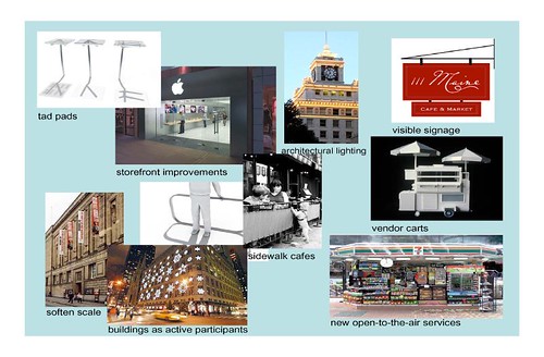
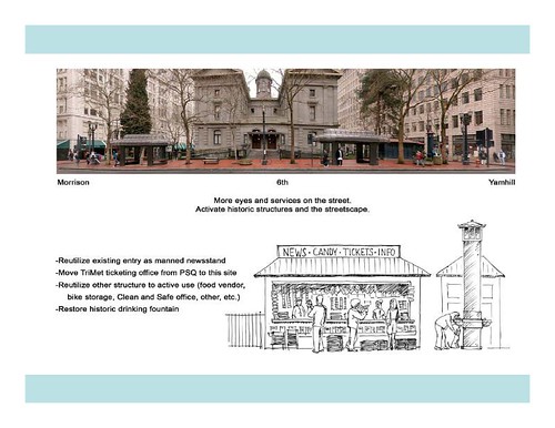
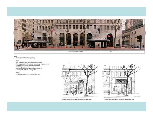
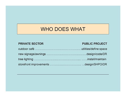
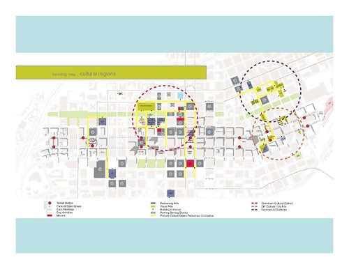
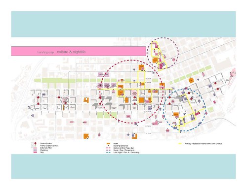
Savinar was kind enough to sit down with me and go through his design notebook, which also exists in PowerPoint form. Here are a few of the sketches and ideas from the notebook.
If every transportation project in the City had this level of thought going into the placemaking aspects of the project, I’m sure we’d have an even more vibrant City.
Keep up the good work, Tad.
2 responses to “Designing the Transit Mall, Twenty Feet at a Time”
I’ll also point out that the DJC article talked about Savinar “pushing out” big firms like ZGF and Shiels Obletz to get this assignment.
In fact, Tad tells me this is not the case, and he’s actually a subcontractor to ZGF.
A couple of points –
The restroom entrances at Pioneer Courthouse won’t be “replaced” so much as “renovated” – the idea is to preserve a bit of history.
And on the topic of preserving history: Most of the original iconic transit shelters on the mall are going away as part of this project. I’m not a big fan of the new shelters, but I can say that there was an intense public process and the new shelter designs were significantly adapted to respond to public input. (I just think the old ones do a better job overall, but I understand the trade-offs involved.)
If you are a fan of the old shelters, the only way any are going to remain on the mall is through adaptive use, such as becoming vendor kiosks (newspaper stands, coffee shops, flower stands, etc.), so if you have an opportunity to send in comments about the mall project, please be sure to mention that you support retaining multiple existing shelters for alternate uses.
– Bob R.